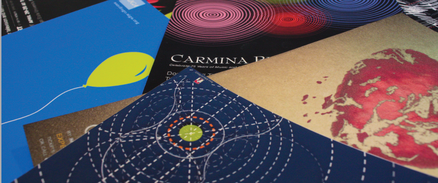
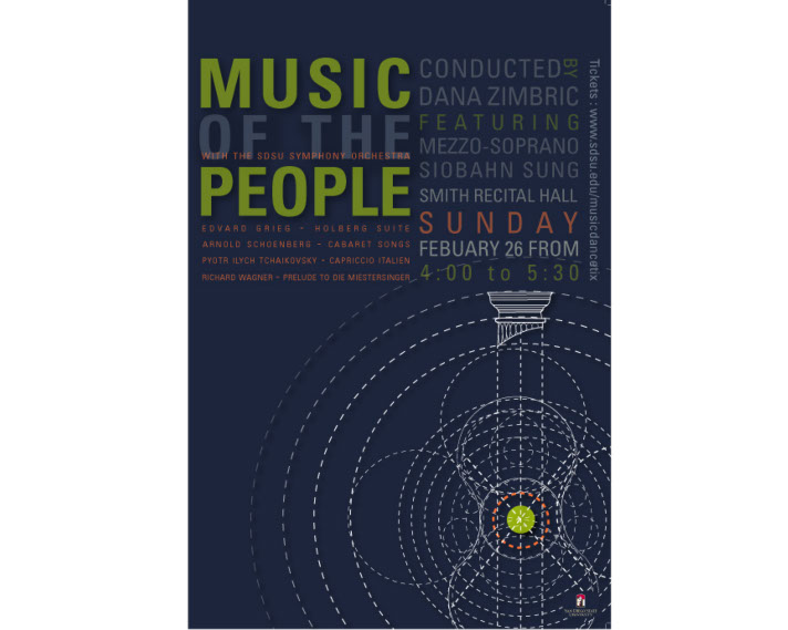
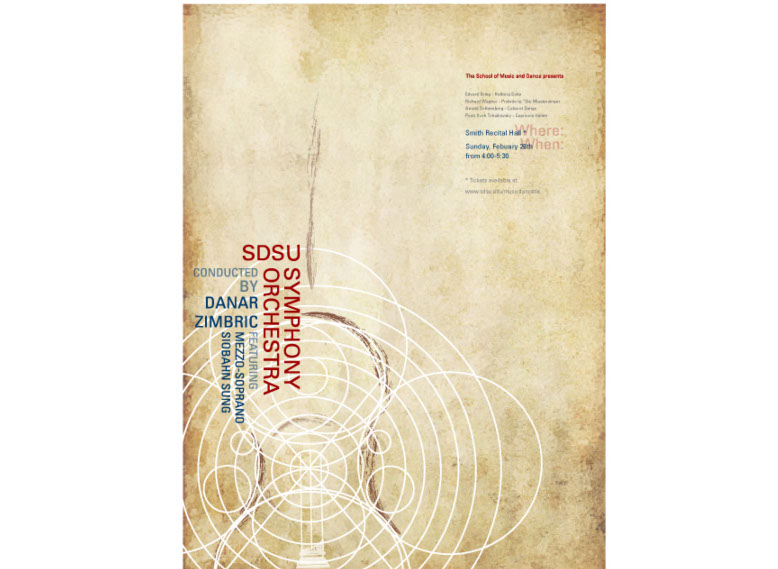
The design for the SDSU Symphony Orchestra poster derived from the factors that each composer used to come up with the music and decided to use that as the concept. For example Tchaikovsky took a trip to Rome where he encountered with an Italian street festival. He got inspired by the carnival and wrote Capriccio Italien. Edvard Greig composer of Holberg Suite got his inspiration from the Neoclassical Movement. Therefore, a dynamic architectural imagery is included to represent the street carnival, and a Corinthian Colum to represent the neoclassical movement. Furthermore, the music itself was used for further inspiration. There are several circles in my poster that make up a perfect viola, using Fibonacci rule for a perfect composition. The circles also represent the waves of the music and voice from Wanger’s opera and it intensity that gets louder and louder of course in unison like an orchestra. The posters represent what will happen during the performance. The font that I chose Univers is to create a high contrast between the circular lines to make the poster more appealing. The striking imagery creates a captivating atmosphere with a subtle exotic mystery that triggers curiosity and interest.
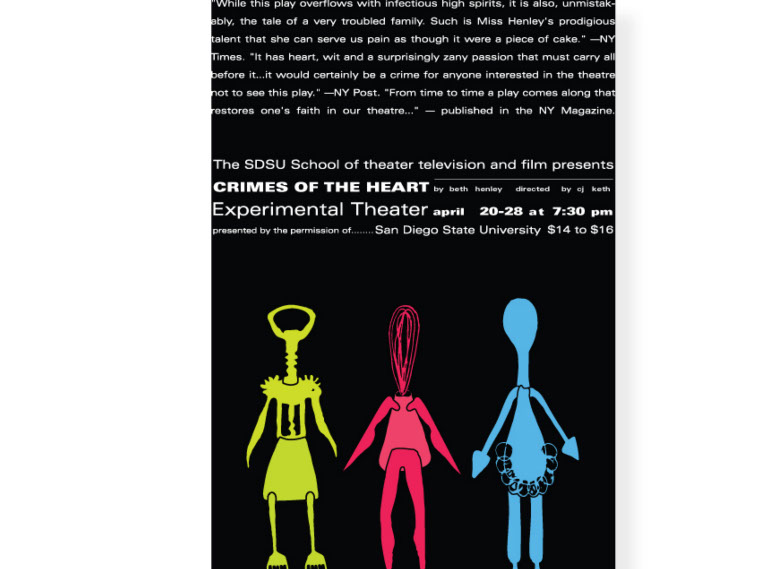
Crimes of the Heart is a kitchen sink drama. The play is about three sisters who go through heart crimes. This poster is composed of the three sisters designed with kitchen utensils corresponding to their personalities and actions during the play. It is a surreal design with a contemporary look to add uniqueness to the design using simple and bold colors.
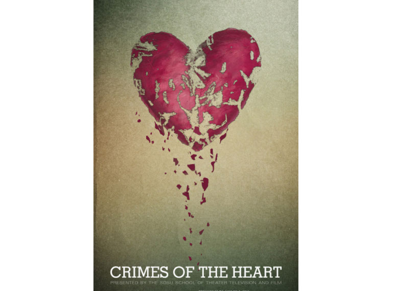
The poster designed for Crimes of the Heart a play a kitchen sink drama, is designed to have a strong visual appeal and at the same time capture the essence of the play. The play is about three sisters that are involved in emotional crisis, all at one point feeling heart broken. The visual representation of their emotions is the heart melting/ breaking into pieces. The color pink used for the heart plays an important part in crimes committed in the play. A serif typeface is used in the design to represent that the play takes play in Mississippi in the 1980’s combined with a serif typeface to represent to the modern interpretations of the play.
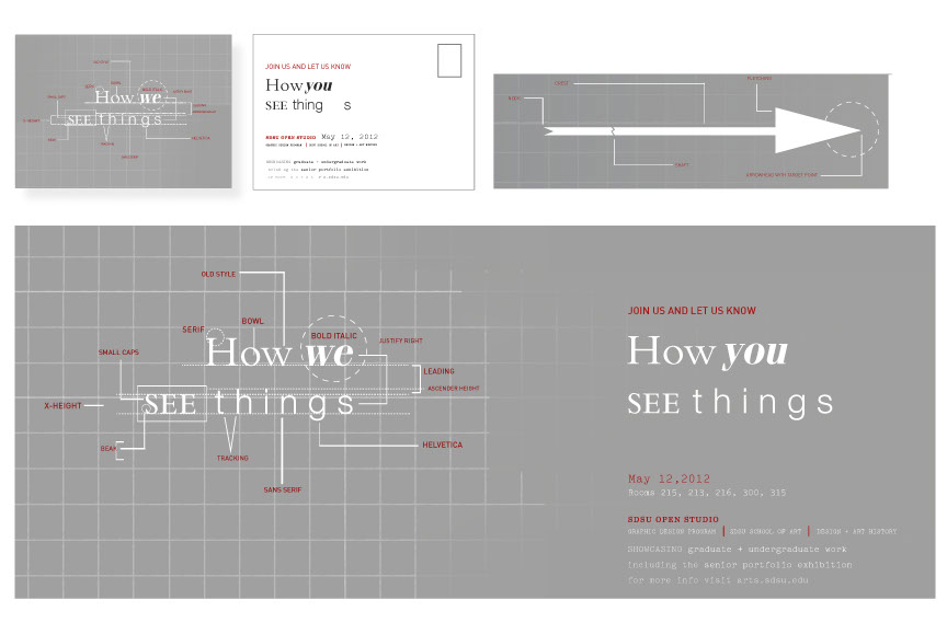
The Poster was created for the Open Studio event at SDSU where graphic design students show their work to people unfamiliar to graphic design.Designers have the privilege in seeing things our own way. After our education as designers we tend to analyze each part of a letter, the spaces between words and distance between letters. We learn to identify typefaces and even judge if the amount of leading used is correct. I wanted to show the contrast between what a designer sees and what a non-designer see.
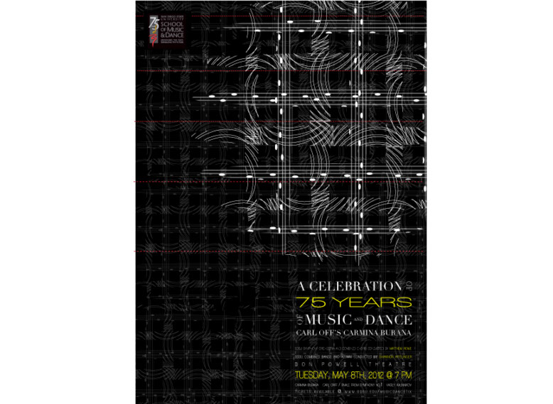
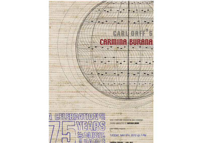
This poster was required to represent and epic and grand event and have a surreal feel to it. A world globe was used and abstracted to with music notes from the concerts main song Oh Fortuna including wavy lines to represent the idea of Music and voice coming together. A blend of a slab serif and a serif font plays with the concept of old symphonies being played by new generations. Furthermore representing that both the faculty and students coming together. The color is appealing to an older crowd with its elegance of reds whites and black and has a modern appeal with the high contrast and texture to appeal a young audience as well.
Option Two : This poster was required to represent and epic and grand event and have a surreal feel to it. A world globe was used and abstracted to with music notes from the concerts main song Oh Fortuna including wavy lines to represent the idea of Music and voice coming together. A blend of a slab serif and a serif font plays with the concept of old symphonies being played by new generations. Furthermore representing that both the faculty and students coming together. The color is appealing to an older crowd with its elegance of reds whites and black and has a modern appeal with the high contrast and texture to appeal a young audience as well.
Option Three : This poster was required to represent and epic and grand event and have a surreal feel to it. A world globe was used and abstracted to with music notes from the concerts main song Oh Fortuna including wavy lines to represent the idea of Music and voice coming together. A blend of a slab serif and a serif font plays with the concept of old symphonies being played by new generations. Furthermore representing that both the faculty and students coming together. The color is appealing to an older crowd with its elegance of reds whites and black and has a modern appeal with the high contrast and texture to appeal a young audience as well.
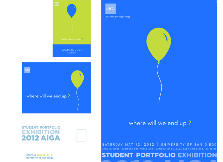
This Poster was designed for 16th Annual AIGA Student Portfolio Exhibition. The concept behind the poster is The balloon represents us as designers, as well as our individualism, ideas and most importantly it portrays the idea of expressing freely, just like the balloon moving through air. Where will we end up? It’s the questions all designers ask. Some of us will get stuck on branches and others will fly away and reach far beyond our dreams. The imagery of my poster has the appeal of being a simple design with a very strong concept behind it. For the same reason that is so simple, colors play an important role in the poster. The bold colors where chosen to make the poster stand out, and catch immediate attention.
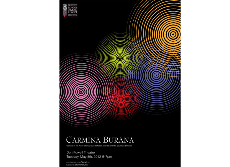
This design represents the epic, celebratory event of 75th years of music and dance. The concept for this design has the outcome of including five
different circles, to represent the five ensembles coming together all different, uniting in a dynamic celebratory composition. The circles itself create movement to the eye, creating optical illusion, to represent the movement of the music. This circle could represent many things to the viewer and that
is what makes this design unique. They can be seen as spotlights used on stage, the profound changes in sound of different music sounds, and most recognizable the sound waves of different instruments growing and expanding to create a harmonious design, just like the harmonious and epic show
that will take place by this concert.